
The story behind the logo
VISUAL IDENTITY
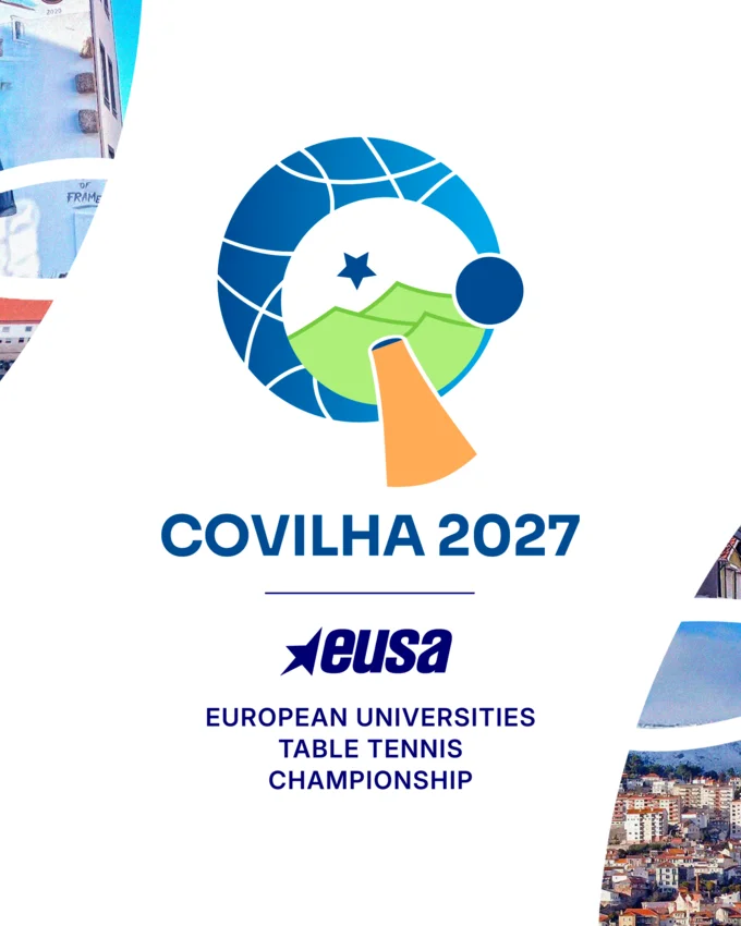
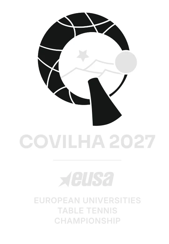
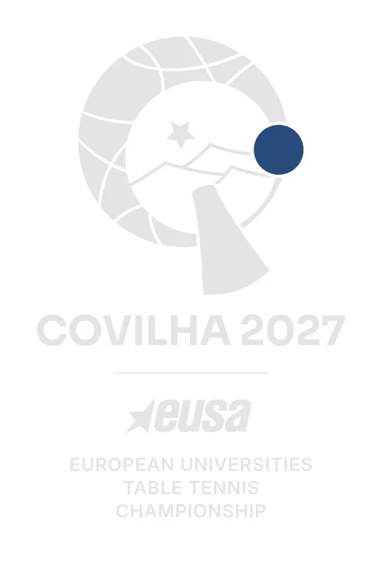
The official visual identity of the European Universities Table Tennis Championship 2027 brings together the essence of the sport and the distinctive character of its host city, Covilha.
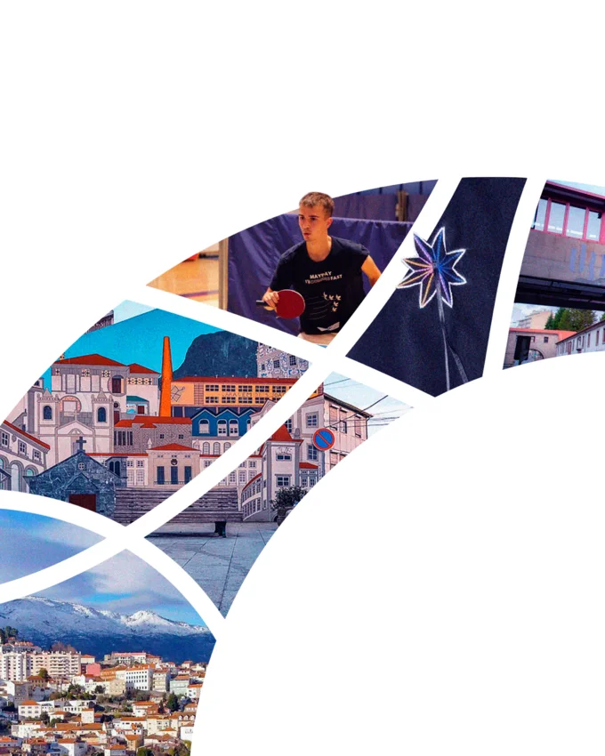
More than a representation of table tennis, the logo tells a story of industrial heritage, mountain landscapes and academic traditions, connecting the championship to the place where it will take place.
01
THE RACKET
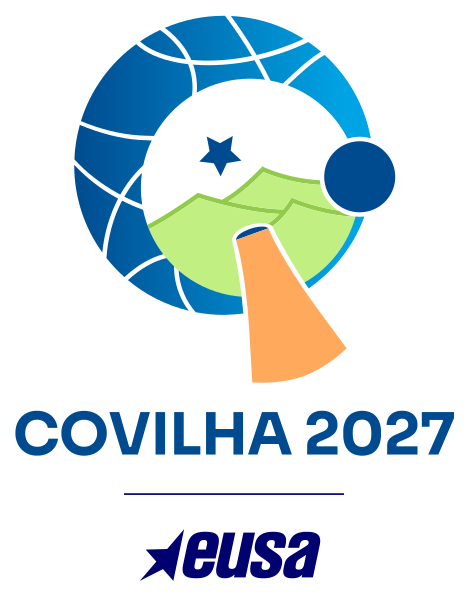
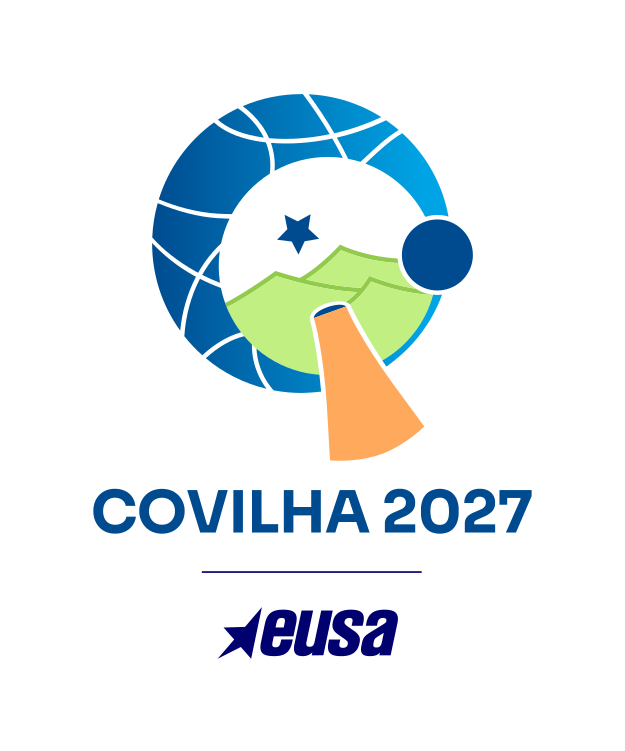
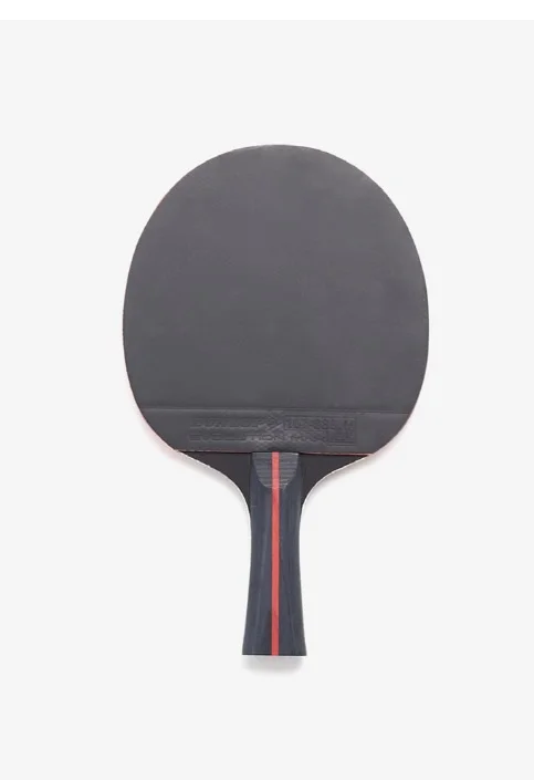
The table tennis racket forms the central element of the logo, bringing together the different symbols that define its identity. Its circular shape evokes the letter 'C' for Covilha, while incorporating references to the city's history, natural surroundings and university heritage.
02
THE CHIMNEYS
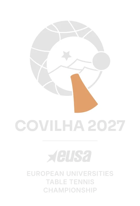
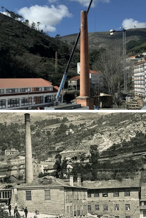
The racket's handle draws inspiration from the distinctive chimneys of Covilha's former woollen mills.
For centuries, the textile industry shaped the city's economy, architecture and identity, leaving a legacy that remains visible in its streets and buildings. By incorporating this element, the logo pays tribute to the industrial heritage that helped define Covilha.
03
THE WOOL
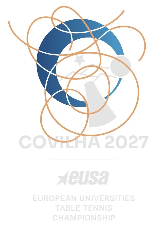
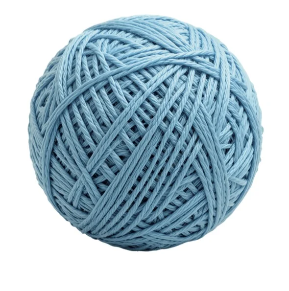
The lines surrounding the upper section of the racket represent the threads and fabrics associated with Covilha's centuries-old wool industry. Together with the circular shape, they also evoke a ball of wool, reinforcing the connection between the championship's identity and one of the city's most enduring traditions.
04
THE STAR
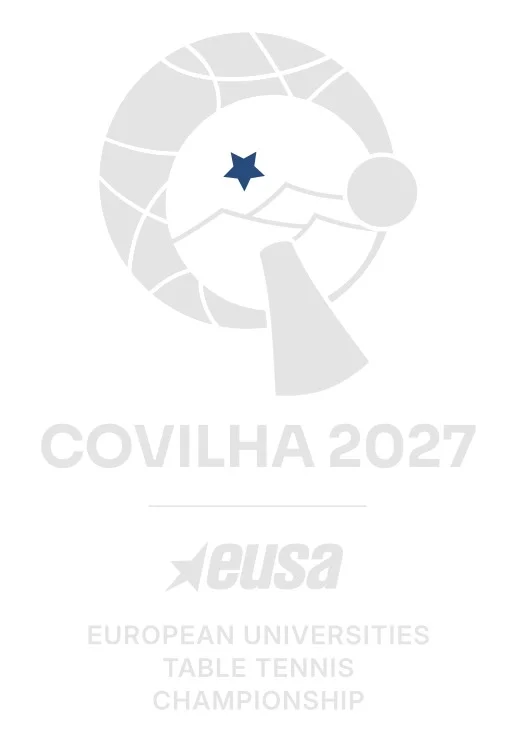
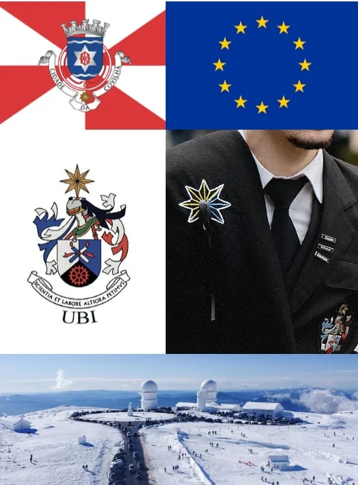
The star brings together several dimensions of the championship's identity. It references the Serra da Estrela, pays tribute to the academic dress of the University of Beira Interior and reflects the European character of the competition through its connection to the stars of the European flag.
05
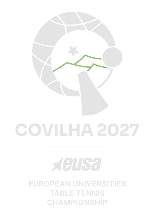
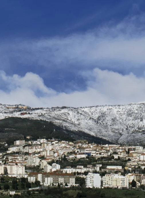
THE MOUNTAIN
The mountain silhouette represents the Serra da Estrela, the highest mountain range in mainland Portugal and one of the most recognisable landmarks of the region. Also featured in Covilha's municipal coat of arms, this element highlights the city's close relationship with its natural surroundings.
06
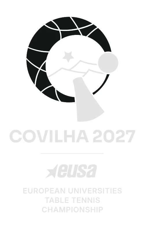
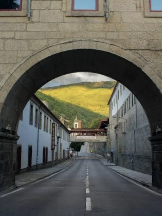
THE ARCH
Inspired by one of the most recognisable symbols of the University of Beira Interior, the arch represents the university's strong connection to Covilha. Its inclusion highlights the academic dimension of the championship and the importance of bringing together university communities from across Europe.
07
THE BALL
The table tennis ball completes the composition, reinforcing the sporting identity of the logo. Together with the racket, it creates an immediate connection to the competition while maintaining the balance between the different symbolic elements.
Every element tells a story
A SHARED IDENTITY
Every element of the logo has been carefully chosen to represent a different aspect of Covilha and the championship. Together, they create a visual identity that celebrates the city's heritage, its natural landscape and its academic community, bringing them together through the shared language of sport.